
Creating great art is as much about problem solving as it is about skill, creativity and imagination. When I create artworks I’m constantly looking for solutions to make things easier, making discoveries which are not only useful to me but also to my students.
Sometimes its just a little tip, tweak or realisation that can make all the difference; sometimes its a major discovery that has taken years to percolate through my mind until I reach that ‘aha!’ moment. It’s often a bit like being a detective as much as an artist and art instructor!
Sure, there are so many of these tips already packed into our courses, but there are always new little useful things I come across every week, things that might be useful to you to save time or improve your art technique.
So from this week onwards, rather than waiting to include these things into major course revisions, I’ll be including these kinds of tips and discoveries in a weekly blog and newsletter.
I also usually post great examples of DrawPj student artworks on our FaceBook page, but from now onwards I’ll be also posting them on DrawPj.com and in the newsletter.
I encourage you to comment on the blog posts or just reply to my newsletter via email. I’m always happy to hear from you.
So, lets get started…
This week I’m introducing you to three fabulous student course artworks, and telling you about a great colour pencil related tip which has been not only useful to me, but to anyone who uses this wonderful medium.
Ana Victoria Guardia: Self Portrait Charcoal Drawing from Unit Three
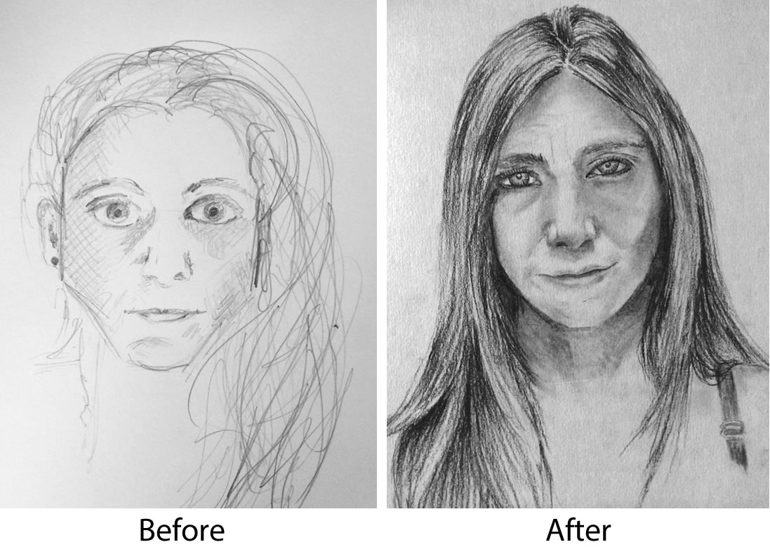
Ana Victoria Guardia has created an amazing self portrait for her final project in Unit Three. The exciting thing is that she has made incredible progress with her skill development from when she first began with us. You can see her progress from her Before image compared to her After image here.
Ana has successfully used her comparison of angles, sizes, tones and spaces skills to carefully create a successful likeness in this portrait. She has also applied her 12 charcoal techniques beautifully. Ana has created many soft edges, hard edges and gradations as she developed the facial features. In the hair we can see some wonderful hatching strokes and fine lines that define the individual clumps and then lots of expressive wavy hatching lines and curves to create the illusion of long flowing hair.
The full light areas, half tones, shadow edges, reflected light areas and cast shadows are all successfully applied. Ana could have added more white conte in places to further bring forward the full light areas but other than that this is already a stunning portrait. Well done Ana!
Mofuoa Mofuoa: Silver Kettle – Unit Two: Shading and Form
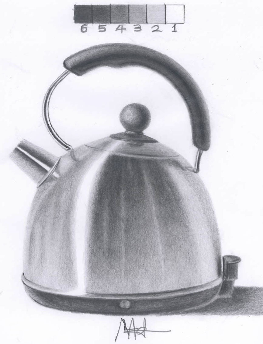
This silver kettle is a very important exercise that helps you to first of all learn to discover the five major areas of light and shadow (full light areas, half tones, shadow edges, reflected light areas and cast shadows) then where to position them in your drawing.
This drawing exercise also requires your skilful ability to create the three ways of shading that are taught in the very first week of unit two (soft edge, hard edge and gradation.) Mofuoa has succeeded in fulfilling all of this criteria to create this stunning version of the Silver Kettle. Well done Mofuoa!
Rosie Johnston: Apple Glorious Apple – Unit Five: Colour Pencil Techniques and Colour Theory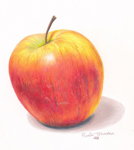
In this exercise from our Unit Five course Rosie Johnston has successfully created a gorgeous hyper realism drawing of the Apple Glorious Apple drawing using Prismacolor Premier pencils. Rosie has used her knowledge of light and shadow theory (that was learned during our Unit Two Shading and Form course) combined with the coloured pencil techniques and colour theory taught during this Unit Five course.
Her application of the coloured pencil medium is absolutely beautiful. Rosie has used a very fine application to position all of the different colours then successfully burnished to create this smooth shiny apple. Well done Rosie!
And here’s the Colour Pencil Tip!
I searched out this solution because (a) some student countries have better access to differing brands of quality pencils and (b) I myself own multiple brands of colour pencils. It can be frustrating and time consuming to try and work out equivalent colours between pencil brands. The solution is to either figure out a colour conversion for yourself or purchase a chart where someone else has already done all the hard work.
So, if you aren’t able to purchase the Prismacolor Premier brand of pencils that are recommended and used in our Unit Five and Six course modules then you might find this colour conversion chart very helpful . Karen Hull – an amazing coloured pencil artist has gone to a huge effort to create this.
Karen’s conversion chart is well worth the price. The link above is not an affiliate link; I simply feel it’s one of the best colour conversion charts there is.
That’s all for this week. Remember to show up at the table and the rest will take care of itself!


Absolutely stunning drawings, Mofuoa and Rosie!!
Congratulations Ana Victoria for completing unit 3 !Amazing portrait!
Beautiful student artworks, congratulations!